We were recruited to help guide JCPenney’s digital transformation by building a responsive shopping experience that would eliminate the need to managing multiple websites on across separate platforms.
JCPenney is one of the longest standing department stores in the nation boasting an impressive product catalog ranging from clothing, household appliances, and a range of home services.
The project was the largest design team I had worked with during my tenure at projekt202. The engagement was the first opportunity to apply my design system knowledge across a large team.
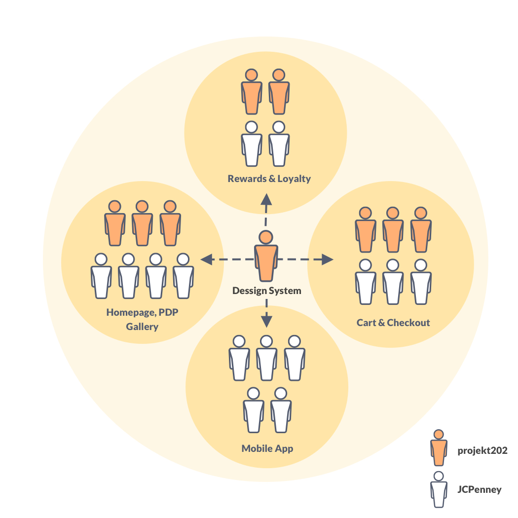
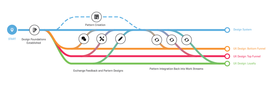
The project consisted of 4 work streams, all representing a different sections of the eCommerce website. Each pod consisted of a blend of projekt202 and JCPenney designers.
In addition to designer, we also had two program managers and a creative director overseeing our designers.
I was tasked with creating and defining the visual language for the eCommerce website that would serve as the central design system.
My daily tasks included creating and maintaining the master sketch files, authoring embedded UI documentation, providing work streams with design reviews and support, and educating the organization on design best practices and process.
Throughout the tenure of the project I was responsible for enforcing visual consistency and quality across the four workstreams.
Large retail stores were struggling to make the shift to digital. An archaic approach to creating websites and developing software has left most organizations unprepared to take advantage of digital marketing and eCommerce channels
The pressure from online eCommerce companies, such as Amazon, had forced JCPenney to transform. A long standing brick and mortar company with a diversified product catalog and even more complex business structure provided a unique opportunity to apply our methodology for creating better software.
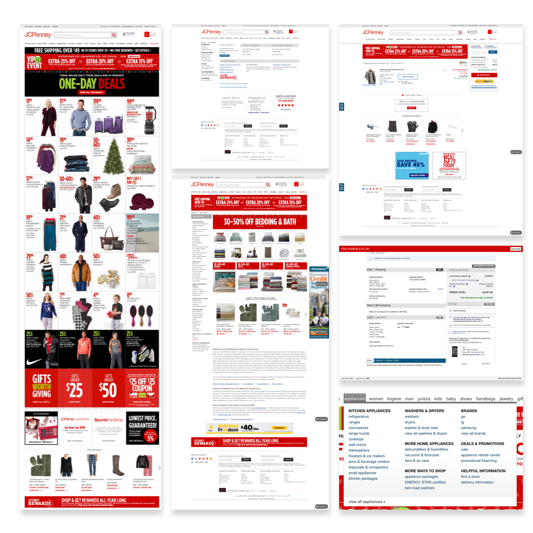
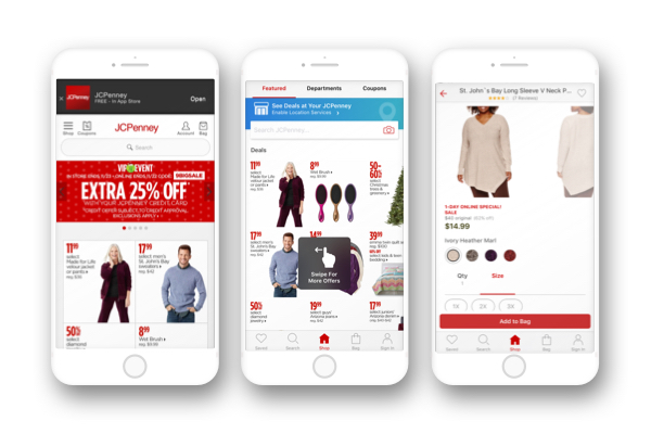
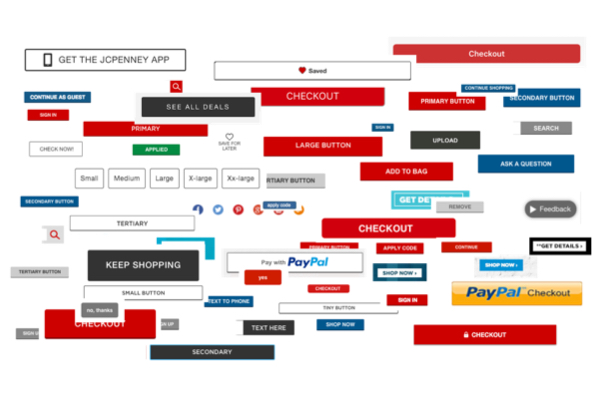
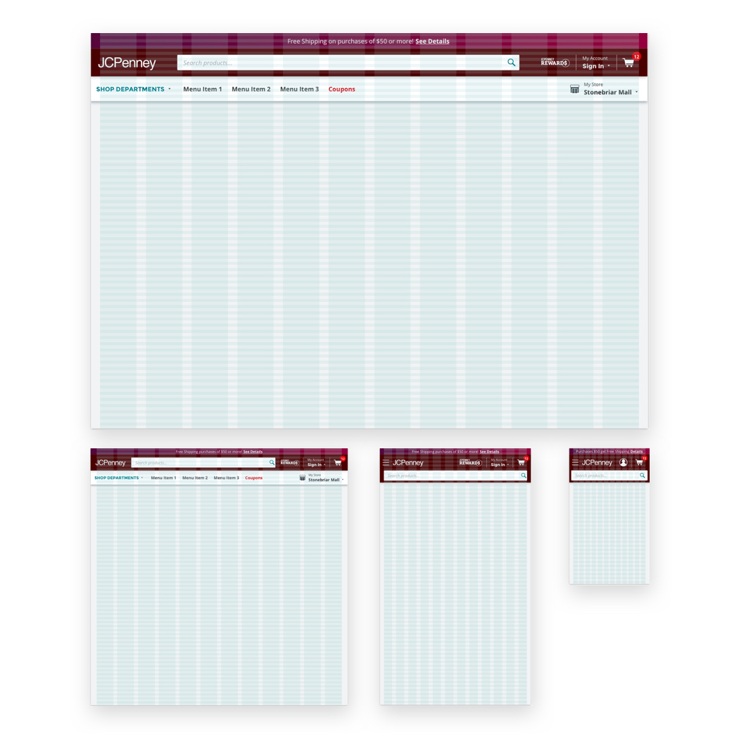
One glaring issue was the legacy website was not responsive. Each site lacked cohesive style principles, resulting in a disjointed experience and inconsistent display of content and functionality.
“The current website has a bad customer experience. Very Frankenstein-ed. Band-aids over fuzzy logic.”
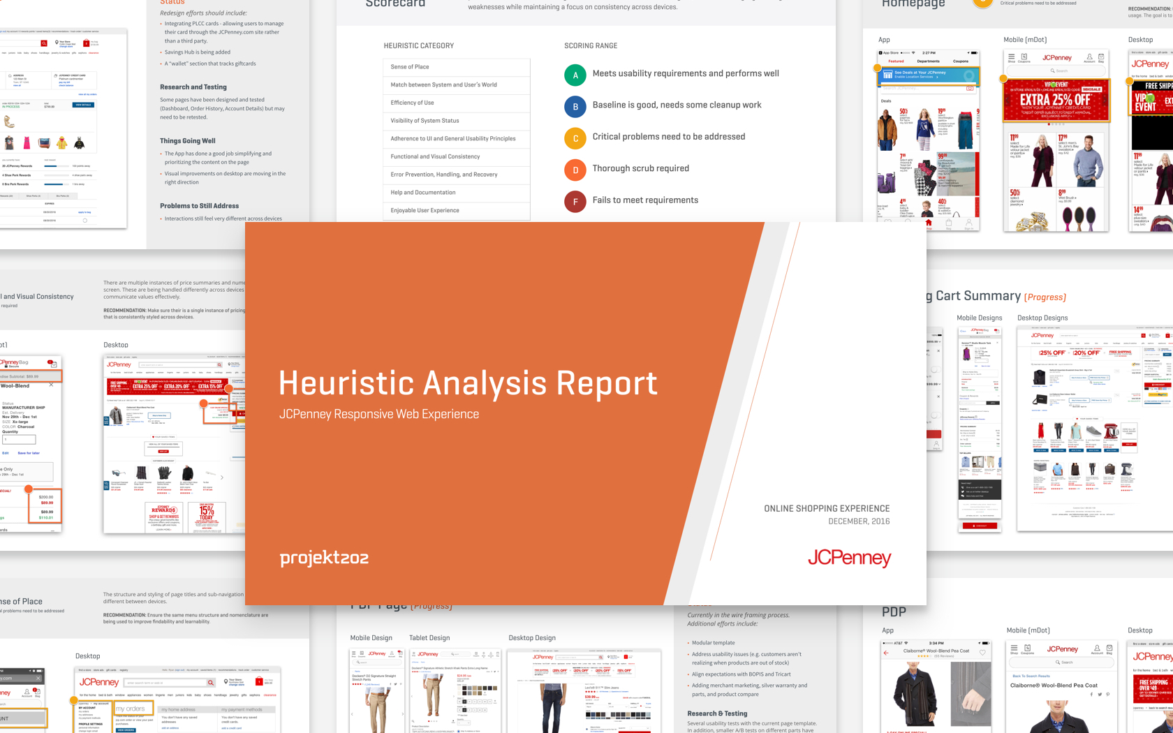
The heuristic evaluation targeted the full eCommerce website and past design exploration completed by teams. The evalution revealed a myriad of usability problems across the customer journey.
While this is not typically how a heuristic evaluation would be administered, often it target a single area, the results provided an opportunity to educate the company on accessibility and general UX best practices.
A workshop was conducted to help align team members around terminology while prioritizing components to serve both the business and design teams efforts.
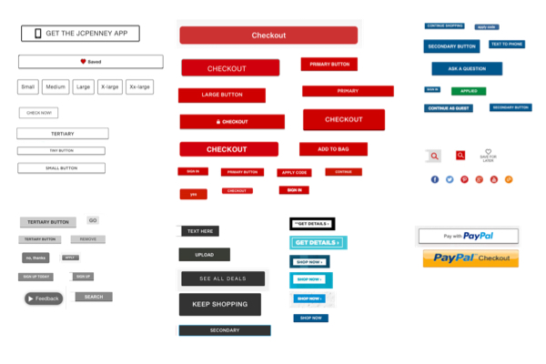
Teams were shown pattern examples and given a budget of checkmarks to apply to desired components for consideration. We utilized a hybrid of Brad Frost’s “Interface Inventory” and Nathan Curtis’s "Component Cut-Up Workshop" to capture and categorize important products and important individuals to include.
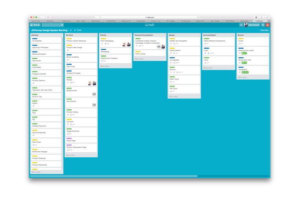
Inventory and categorization all existing design assets currently in existing on website and design files. Due to the fractured nature of the organization each division of the team was using different tools, standards and methods. Additionally ancillary teams such as marketing and independent app teams were included to ensure a holistic approach to aligning the company.
An inventory of the components spanned across multiple codebases, legacy websites, mobile applications and independent mobile apps.
The need to bring all designs under one file was necessary to acheive alignment. Collecting existing design files provided me an opportunity to engage with each workstream to understand their design system needs.
While dedicated research is preferred for design systems, the expedited nature of the project forced me to take a more 1:1 approach with how I engaged with the designers and developers.
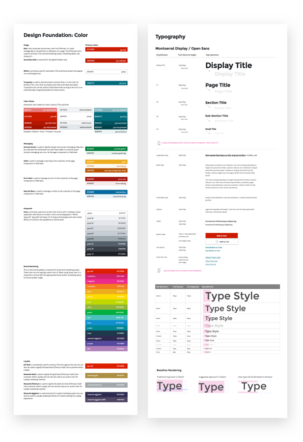
Referencing previous design foundations, research, and brand guidelines, enabled me to create several explorations in an effort establish a common visual direction. We wanted to make sure we were creating UI that would echo JCPenney’s brand and mission statements while informing consistent design decisions in the future.
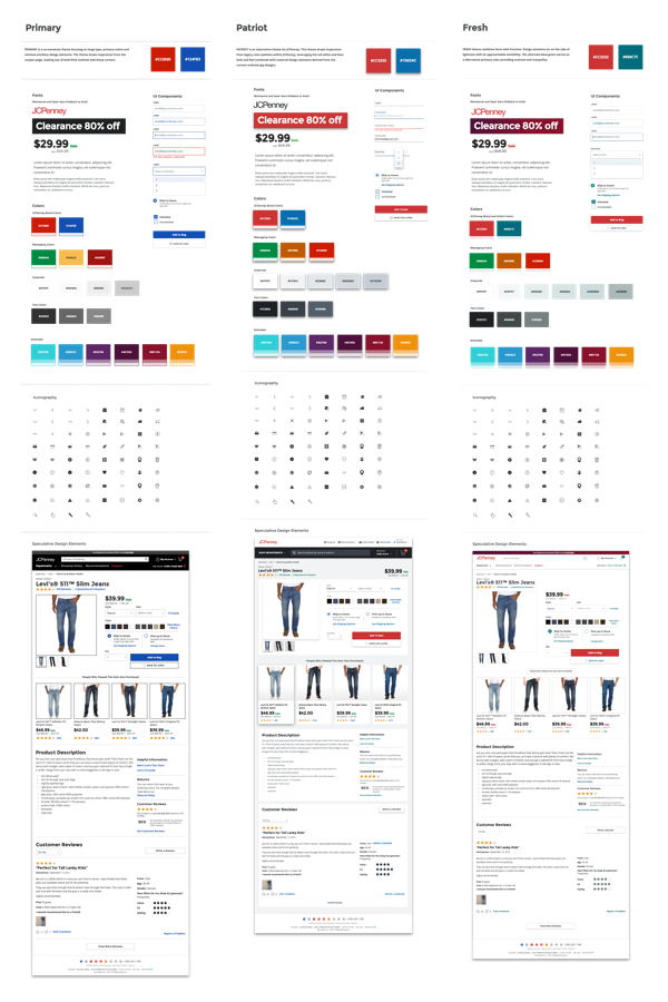
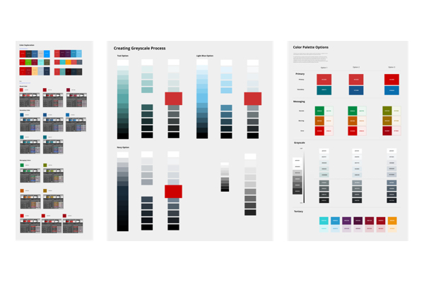
Extensive color research centered around accessibility and brand were used to create a functional yet expressive color palette.
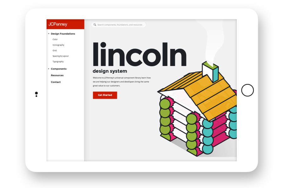
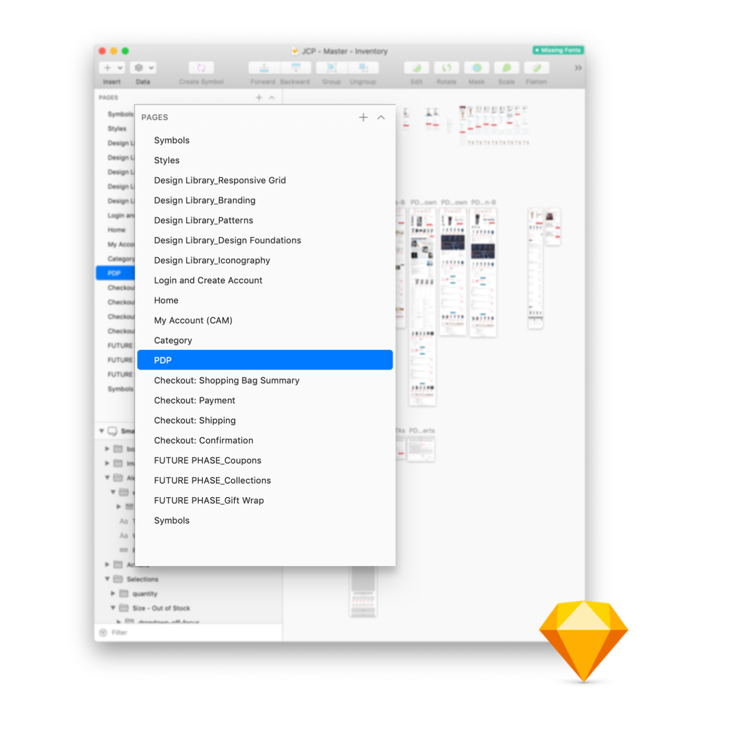
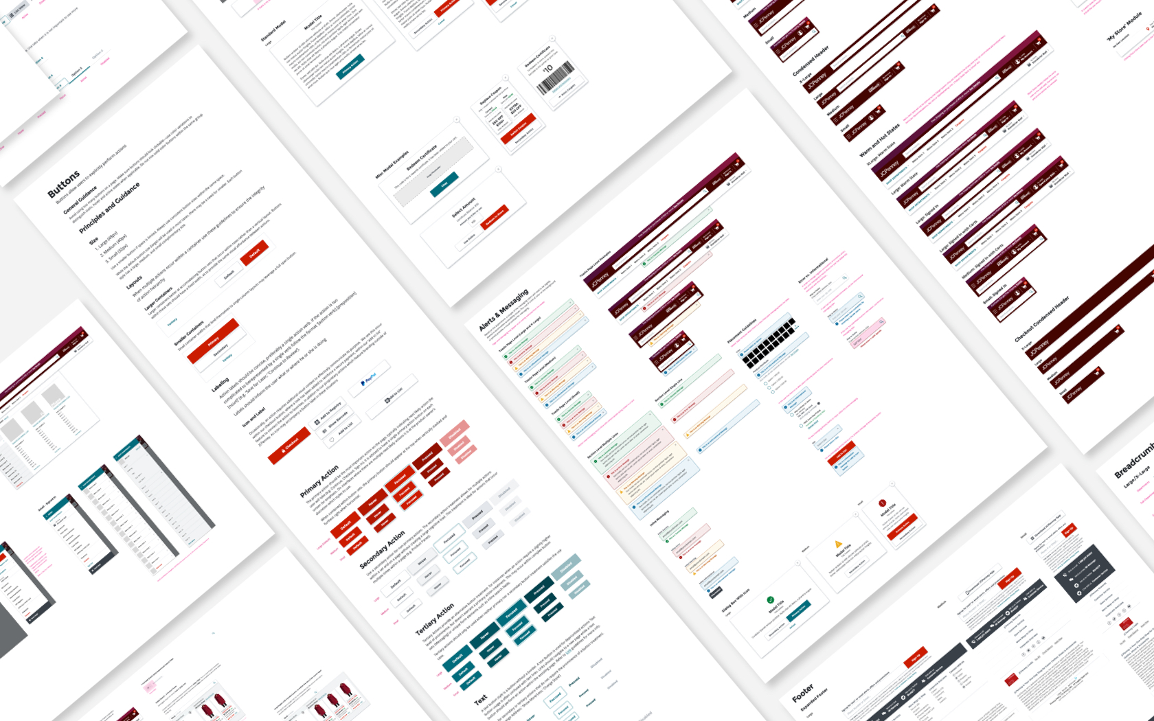
Throughout the project several design resources were created for the team. The most important being the master sketch file containing all foundations, components, page templates, and necessary documentation for implementing UI.
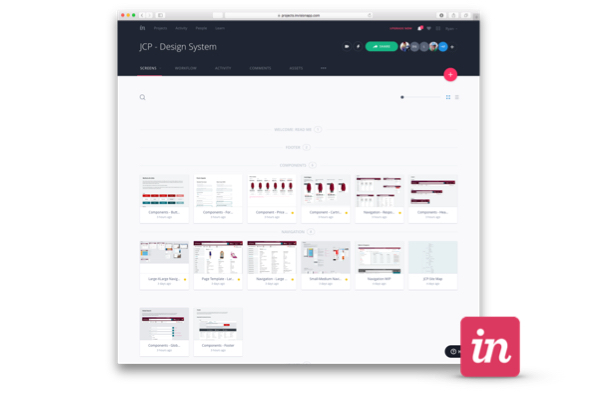
An Invision project was maintained to facilitate design conversation and provide a public facing documentation for designers and other team members.Due to a lack of development resources, a Zeplin project was created to help development teams navigate redlines and UI implementation.
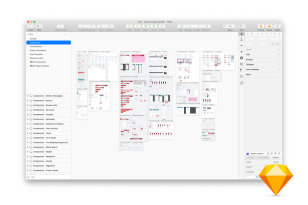
A key to any successful design system depends heavily on the fundamental foundations on which every component, page template, and prototype is built on. After determining a visual direction that complimented the company’s brand while supporting exsisting products and design files, foundational elements were documented in Sketch and published to the Invision project. Members of all workstreams could have visibility and have open conversation around the design decisions being made.
At this point Sketch lacked many of the current shared style and cloud based component libraries. Ensuring the Sketch file was well organized, labeled and public best preactices went on to inform several other future design system enagagements.

Once foundations were established the backlog of components created during the prioritization phase of the project provided a roadmap for delivery.
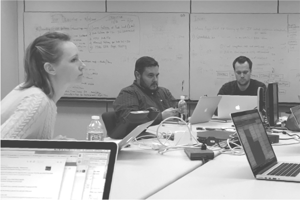
Simple UI evolved into complex components ranging from specialty form fields to responsive navigation. Because I was the sole designer supporting over 20 designers, the speed at which the team needed new components quickly became overwhelming.As the project went on, I began to function more as a director, attending team reviews, providing guidance, and training new designers.
This design system engagement was unique because it enlisted the workstream designers to actively support the design system effort. Instead of waiting for me to create, review and approve every components, we were able to empower the designers with concrete foundations and guidelines allowing them to create new patterns for the library. These elements could be reviewed, absorbed into the library and published back to the broader team.
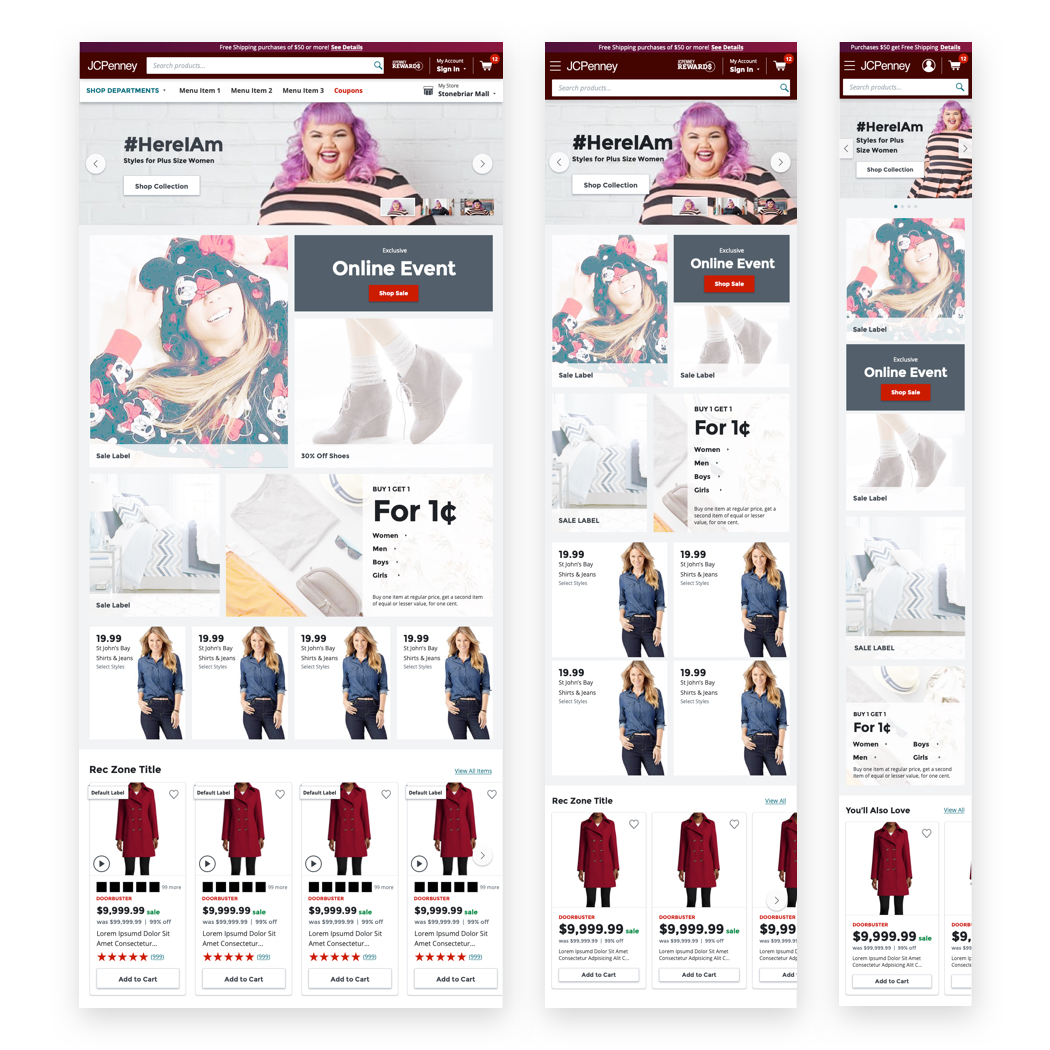
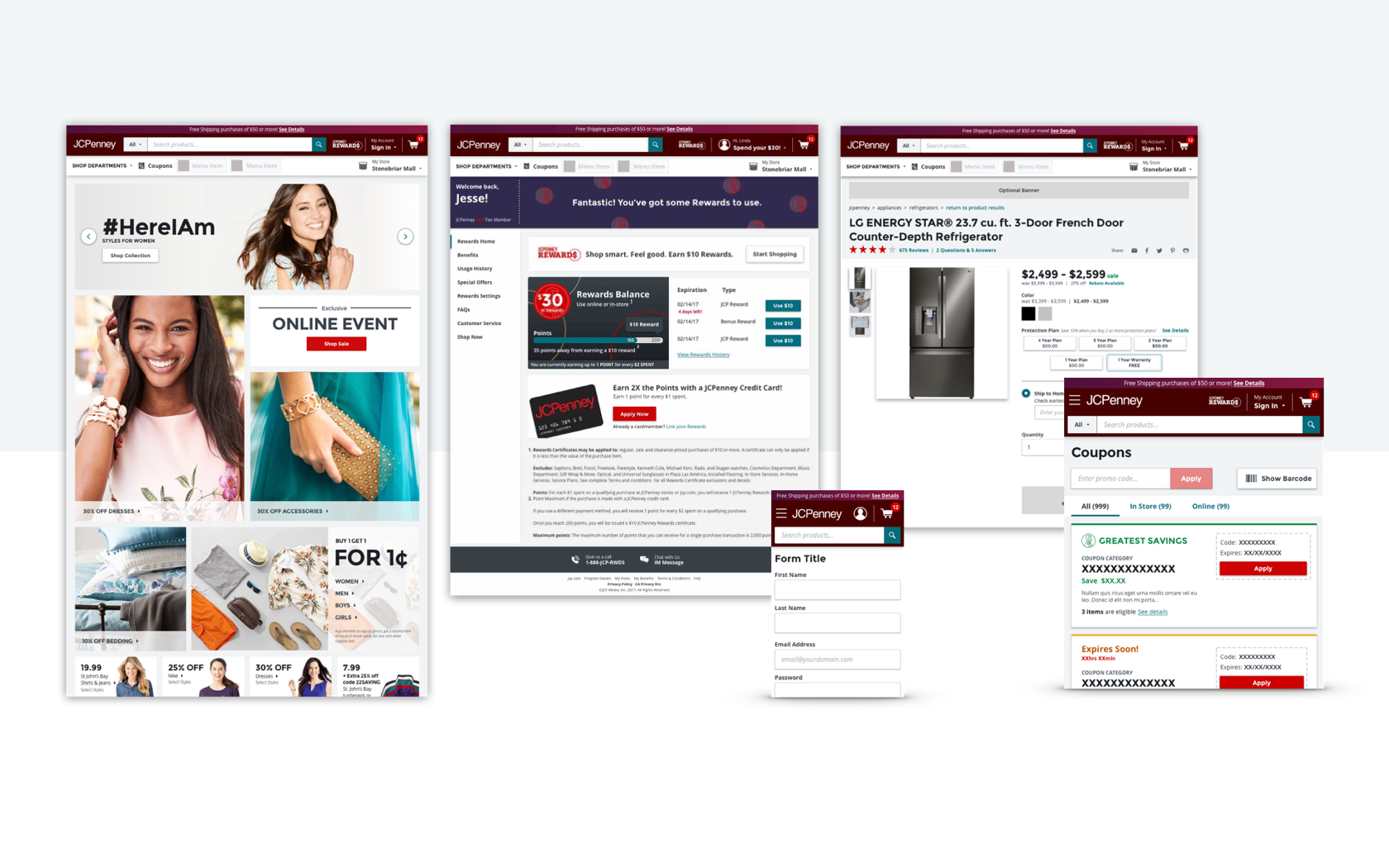
Working with a blended teams across multiple departments created a need for easy to consume page templates. The ability to produce hi-fidelity prototypes spanning the entire eCommerce experience allowed designers to move at a fast pace that the project necessitated.
Aligning and making the designer's job easier improved productivity propogated through to the development practice. Adoption had to be drivenfrom the ground upby the designers and developers rather then the traditional top down approach we take through VP or product management. This helped establish a grassroots movement for adopting the new design system that helped it stick and continue to be used.
The original plan was to create a complimentary documentation site and code base; however, budgetary restrictions limited the system to design assets only. While this was disappointing in terms of not being able to create a fully functioning design system, it provided the opportunity to perfect the structure of design files, sharing rituals, and design system curriculum.
The system was shared in several formats for design and development. All design comps were maintained and shared across Invision and Zeplin. Invision provided designers with a forum to make comments and contribute to the system, while Zeplin was dedicated to developers focusing on redlines and CSS reference.
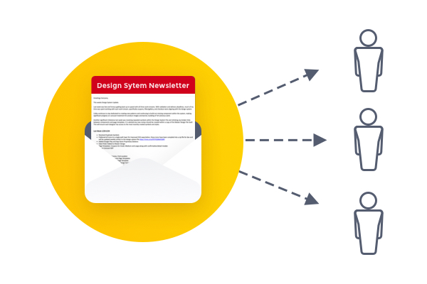
Shared libraries and version control applications were still in there infancy. As a result, I published a weekly email newsletter updating the organization, primarily UX designers, of new additions to the library and upcoming changes. The newsletter doubled as a way for designers to create and request new patterns.
Eventually we were able to have designers contribute proposed patterns through Dropbox. Designers could contribute a partially formed pattern which I could make adjustments, add to the library, and redistribute to the team. This process was vital to speeding up the turn around of components while simultaneously ensuring the designers felt mutually invested.
Training sessions were scheduled for new employee on boarding and existing designers. The structure of these lessons went on to be the structure for internal company training initiatives like Greenhaus and U202.*
Still relatively new, sketch posed unique challenges. There were no shared libraries forcing us to lean on immaculately organized files and storing them in central repository. A high standard for file cleanliness helped establish our best practices for design systems while elevating the quality of the designer’s output.

I would often provide support to workstreams that required an extra pair of hands allowing me to move between product org. This resulted in a high level of empathy for designers and their needs. I would provide authority when defending design decisions to other teams and help brainstorm solutions for problems outside the boundaries of the design system.
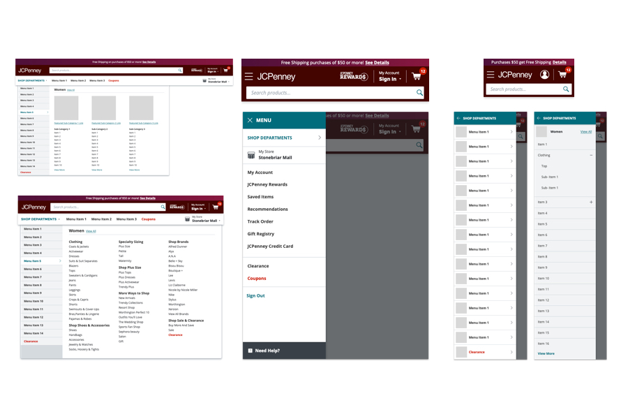
One of the most challenging was collaborating with the a teammate to rearchitect the structure of the global navigation. Given the multidimensional nature of the JCPenney’s product catalog forced us to develop a highly scalable system that could accomodate future explansion and contraction of departments.
Conduting an inventory of all products and departments while performing a card sort with customers helped inform the global navigation recommendations and structure.
This project allowed me to step into an educator role within my company providing guidance, tutorials and review time with the team. It was extremely important the organization understood why decisions were being made and thought process that supported it. This took long meetings of carefully articulated design rationale that peeled back the layers of the once “mystical” design process.
By demystifying the design process we were able to get better buy-in across the organization while reducing confusion around which styles and UI were correct.The JCPenney System was our first modern system constructed in Sketch and would go on to be the foundation for future for all design systems.